Authentication as a Service
A centralized, secure login experience.
Position
UX Design Intern
Timeline
Jun - Aug 2022 (10 weeks)
Team
Commercial Identity, CML.xd
Tools Used
Figma, Miro, UserTesting
Project Overview
During my internship I was tasked with creating a secure login experience for 4 Capital One commercial applications to alleviate customer login frustrations and unify the login process.
As the main designer for this project, I collaborated with my design manager, product team, and research strategists to create many iterations of user flows, wire frames, and high fidelity designs.
Context + Problem
Capital One Commercial customers often use multiple Capital One applications that came with different login experiences and features, which causes login fatigue and confusion for customers. It disrupts continuity and consistency across the C1 commercial applications.
Login is a third of Commercial team's structure.
How might we create a standardized login experience to reduce login fatigue and confusion across different Capital One applications?
Discovery Phase
There was a lot of information that I needed to learn before I could even think about designing. I started by meeting with my manager and product partners to understand the context, problem, existing research, clients, and the goals of the project. As I learned more about the problem and my task, I knew that I needed to examine various login experiences myself to understand the issues occurring among users, identify design practices and opportunities.
As I read more about secure login design, I learned about its nuances. For example, error messages should be kept generic to prevent hackers from gleaning any information from users. I started paying attention to logins designs that I used in my personal applications and I noticed their similarities and differences in features.
Existing login design and the goal.
Understanding Existing Research
Some prior interview research had been done with Capital One associates that frequently receive calls from users about product problems in understanding user frustrations, which was helpful for me to understand the main login issues.
Login Fatigue
"Clients say that there are too many applications to login to. It takes so much time to login." -C1 Associate
"Why isn't there an option to have one login for all these apps?" -C1 Associate
Confusing Language
"[Customers] always get their password wrong because the suggestion (symbol) makes them think it's part of the password" - C1 Associate for Intellix
"They don't remember if they’re supposed to get the MFA code through email or phone."" -C1 Associate for Courier
Audit Capital One Apps
After developing knowledge in login design, I felt that I had a better idea of what to pay attention to when evaluating Capital One's apps. Thus, I needed to familiarize myself with the applications and figure out what to standardize and keep variable.
Key Features Analyzed
1. First Login
2. Multi-Factor Authentication
3. Error States
4. Language
5. Forgot Options
6. User Flow
My notes
Competitive Analysis
I then conducted a competitive/comparative analysis similar to the previous audit to evaluate existing login and MFA experiences. This activity helped me gain inspiration for my designs and identify patterns, gaps, and design opportunities.
I chose competitors based on common Capital One competitors and other products that protect more sensitive financial information.
Aggregate Table of Login Features across the Competitors.
Ideation
Based on the information I gained, there were some new revelations after discussion with the product team. I had to centralize as much as I could but still keep a few features variable based on the specific application because there was not enough time to have the developers change the backend, and my designs still had to accommodate the existing technical system. With each deliverable, I spoke with my team weekly to gain feedback for my iterations.
Design Requirements
Based on the research, I generated a list of requirements the design should:
1. Simplify the 4 login experiences to one flow
2. Accommodate app-specific variations and the existing technical system
3. Allow users to get help easily and fast
4. Provide users with more visibility in the system
5. Use clear language to inform users about next steps
User Flows
As the goal was to create a standard experience, I first developed an agnostic user flow to highlight what would be standard across the applications. Then I created 4 additional flows based on each application to highlight the variable modifications that each app still required.
I learned to be very specific with language on my user flows as if they would be part of the real design. This helped me convey the user journey very clearly to the product partners especially if they were concerned about the security of the login experience.
Low Fidelity Wireframes
After my user flows were approved by my team, it was time to wireframe to not only visualize the features, information, and interactions, but also explore different design directions. Similar to the user flows, I created agnostic wire frames for the centralized experience, and application specific wireframes for specifIc needs, which I presented to my team and product partners for feedback.
In this portion, I learned to take notes on each wireframe to explain certain features for people who were not part of the critique session or for anyone to refer back to later.
Prototype Testing
After creating wireframes, I had to decide between 2 flow designs before proceeding to the high fidelity prototype. Additionally, I wanted to identify any usability issues and understand mental models of information presented to users throughout the prototype.
In this phase, I led research planning, developed the screening survey, tasks and script for testing the prototype. We chose the Flow 1 as the final design based on how much easier it was for participants to obtain help information.
Flow 1
"Oh nice, that information was easy to find." -P1
"To recover my password, I just click on the Forgot Password link." -P1
Flow 2
"I think the Forgot Password option should be in Sign In Help" -P3
"I’m guessing I need to find help information in the Sign In Help" -P4
High Fidelity Designs
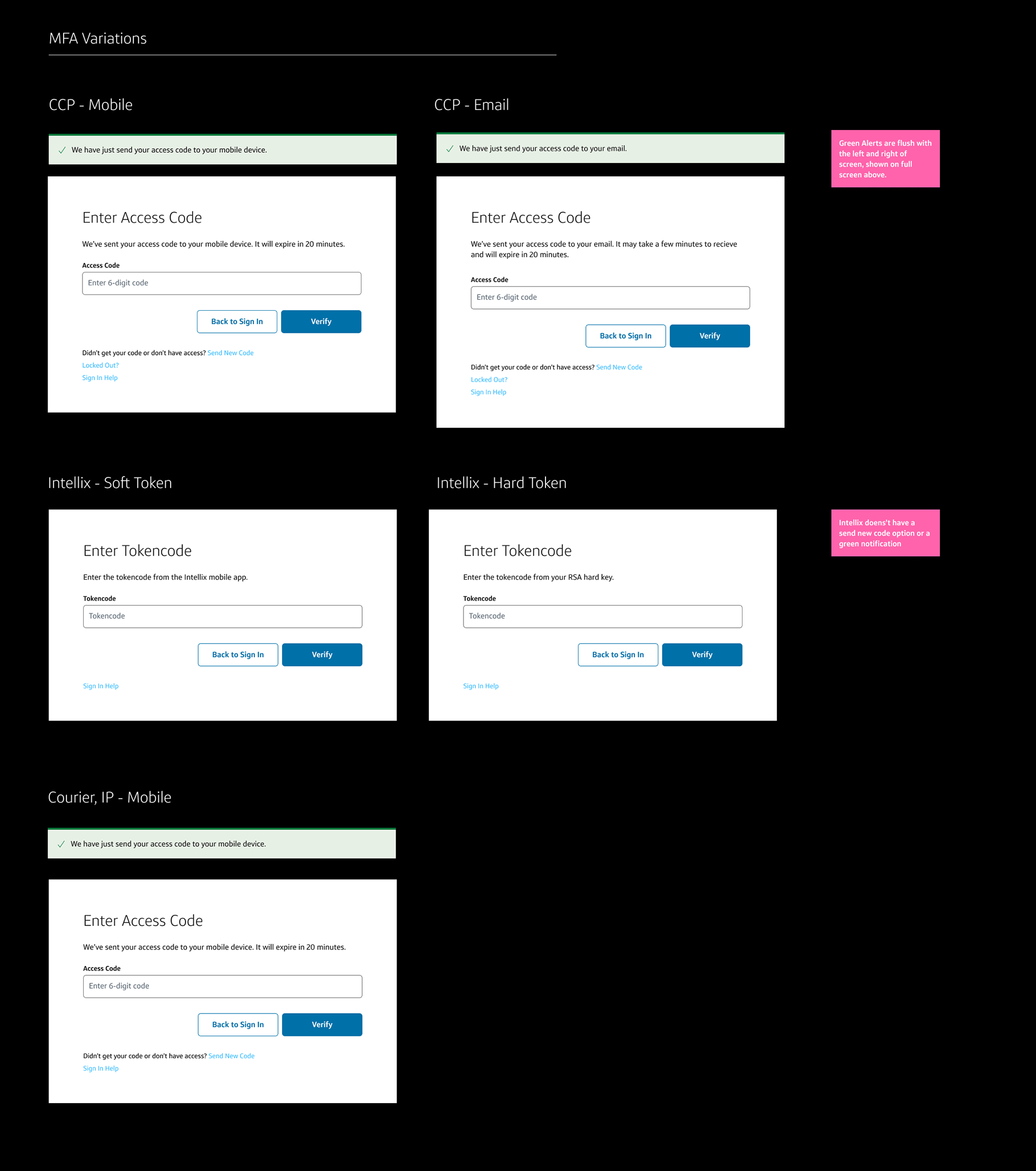
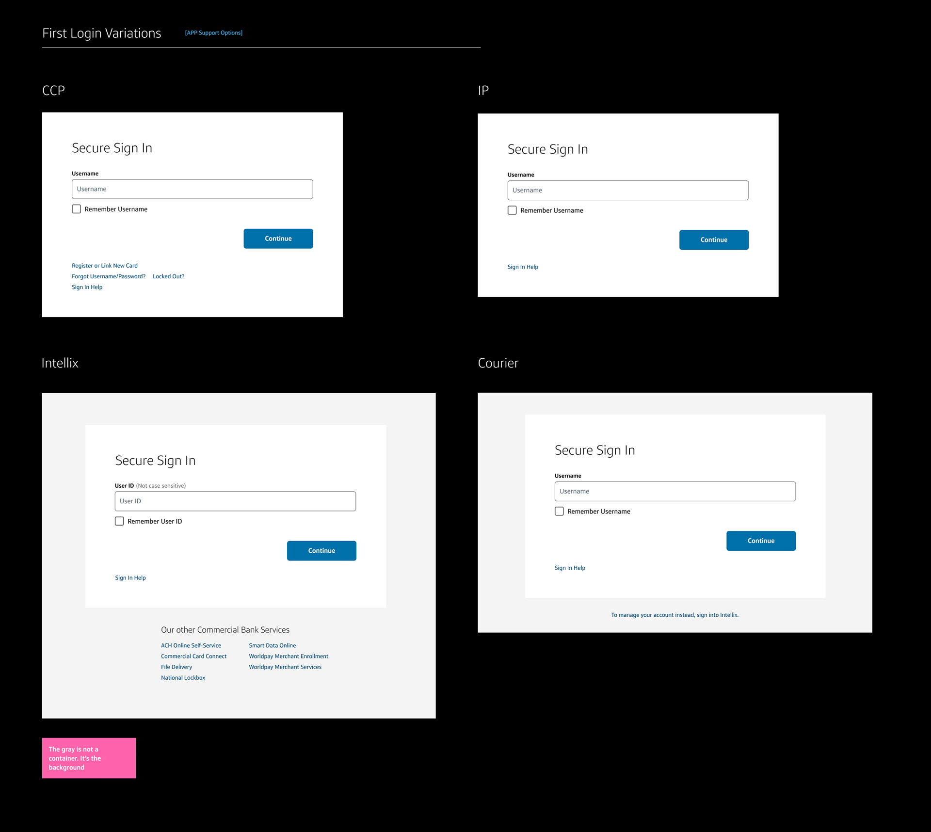
While creating high-fidelity designs, I had the opportunity to use Capital One's new version of their OMNI design system. App-specific language was used for all text and information in brackets to distinguish between different apps.
App-specific Notation
For all text and information in brackets, app specific language was used. This would help distinguish difference apps from each other. These specifics were applied throughout the login and MFA expereinces.
Name and logo would be added to ensure users could distinguish between apps clearly.
Password Options
I added toggle options to let users check if they were entering their password correctly and the caps lock symbol to inform users if that key was on. This would help to alleviate login errors related to password.
Specific Language
Using specific language would give users direction of where to look for information such as. "Your code was sent to your email" and "Your code was sent to your mobile device" instead of "Your code was sent".


Reflection
There's more to login than meets the eye 👁
A login experience may sound simple at first glance, but designing it involves careful consideration, especially regarding security. How might we design a login experience that won't be prone to hacking?
Reading and evaluating many login experiences over the summer, I felt like I became a small subject matter expert in login design. I'm sure there is a still a lot for me to learn, but I really enjoyed learning about login design. My favorite part about being a designer is learning about various products, designs, experiences, and users, and observing these aspects in my daily life.
Understand your audience 🤗
Throughout the summer, I collaborated with many people in design, product, and tech, and I often presented my deliverables cross-functionally. It was crucial for me to understand how to present information to them and to sometimes omit designer lingo. Many thanks to my manager Fran for listening to my practice presentations and the incredible feedback, which helped me present my work concisely to various audiences.
Make connections 👨👩👧👦
I sought out conversations with people outside of my immediate team. I talked to researchers, visual designers, design directors, and product managers to learn about their experiences and life stories. Most of the employees I met all lived on the east coast (of the US), and as someone from the west coast, I really enjoyed learning a lot about the differences in culture and lifestyle.